Unless otherwise credited, all photographs are © David Ritchie and may not be used without my permission.
Framing is at the direction of the client- some people are very definite in how they want the work to appear. Others have few ideas and want my input. Often they need some helpful advice. Others simply hand me the art and leave the mat and frame decisions to me (which can be daunting).
In all cases I follow some personal guidelines:
Frame for the art, you are not in the decorating business. Every project should be designed to compliment the art, whether it be a poster, photograph, painting, drawing, or object etc.
The finished framing should not draw the viewer immediately to the frame, mats etc. The focus must be the art- make it look it’s best. If the viewer studies the subject and only afterwards looks at how colour and frame choices work towards the final result, then I have succeeded.
 An arrangement of a drawing, a sketch and a lino cut by Horace Brodzky.

Catalpa seed pods. A personal project (I’m running out of wall space!) It took me 4 attempts to figure out how to mount them, wasting half a sheet of very expensive woven-grass mat board, but I’m quite happy with the result. It takes time to find the perfect composition. I originally planned to use three pods, but ‘less is more’ is a very wise motto that I try to follow.
 Mat floats above the stamps which, in turn, float above the background for a 3-D effect. Both foreground and background mats have rich, mottled surfaces. This is a more decorative approach, designed to show clients different options.
 Another 3-D type effect with floating tickets and V- grooved black mat with a Florentine Silver frame. Rear (mounting) mat is silver/grey. Tickets to see The Who ($15 each)! A shame that they were never used, but they make a nice frame. I was given full leeway to frame them as I wished.
 Framed slate. I saved a few slates when our roof was replaced with metal. Weather and time make a great artist! This one is mine, but
 I have another one available for sale too late, sold!

Key collection. Another project that I was given free rein to frame as I wished. Sometimes that puts added pressure on me, other projects are easier to design. This one was a challenge. How to compose the keys, what mat colour, frame style and colour, how to attach the keys? Clear epoxy was the best choice but even a ten minute set-up time would be insufficient. I finally found the best product at Lee Valley. Set-up time is 45 minutes and it will even set underwater! I first laid the keys out on another mat board, shifting them around until I had a pleasing pattern (that took countless hours). Manufacturers and eras are loosely grouped. I then transferred one key at a time, with adhesive, to the final mat. I had one chance only to place a key; repositioning the key would leave a stain.

The goal here was to accentuate the chrome era of automobiles. The mat has a shiny steel look to it, although this photo doesn’t show it well. The same mat was used in The Who tickets project. The metal frame has a finely polished highlight that looks very industrial, and the black frame is repeated with the inner black mat. Unfortunately, this frame was discontinued. Frames are like fashion and constantly change. Mats are similar but are not discontinued as frequently.
 Landscape painting on canvas by Laura Woermke
Nielsen aluminum floater frame in German silver. A 3/16″ gap between the frame and the art. Painted black sides of the canvas enhance the floating effect.
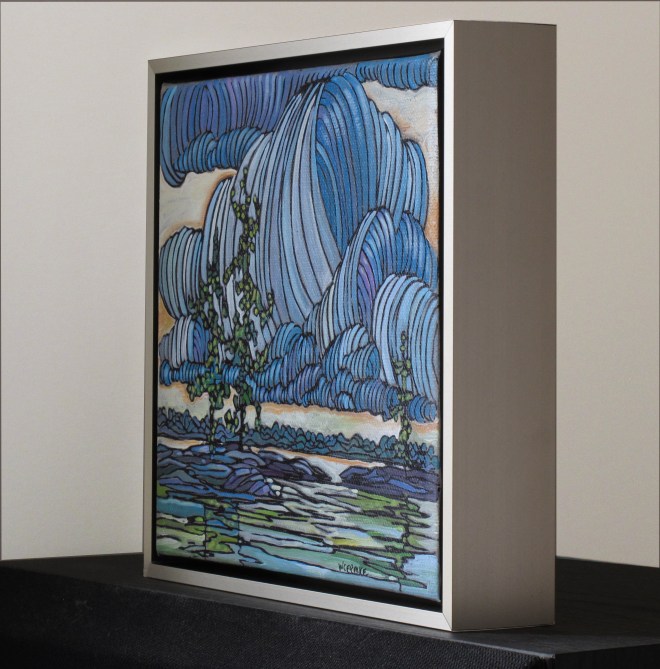 The deep frame sits nicely on a flat surface. At slightly over eight inches square, it’s portable art. Useful when running out of walls to hang frames on.
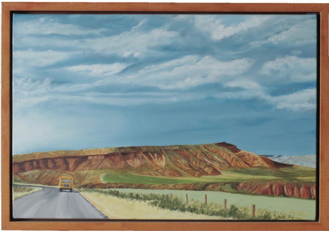 Acrylic on canvas by Jaqueline Francis. Another clean, contemporary “floater” frame. Good choice for stretched canvas. No glass needed. Light glancing across the surface of the painting reveals texture. Easy to clean: vacuum using a soft brush.
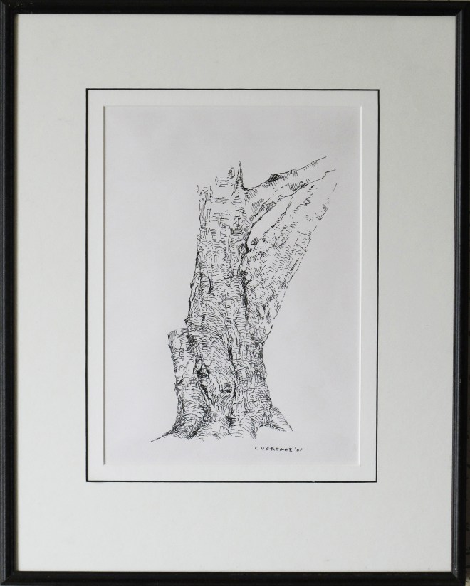
Ink sketch by Connie Gregor. The outer mat is a darker tone than the inner mat and has a black core that is revealed when the bevel is cut. It repeats the line of the frame and outlines the art. The inner mat is lighter in tone than the art paper to create separation.
